

Pro Cleaning Services
A commercial fleet-cleaning rebrand developed to create a stronger, more recognizable identity across service vehicles, uniforms, marketing materials, and digital platforms.
TYPE: Branding, Web Design
TOOLS: Illustrator, Photoshop, InDesign
SCOPE: Logo System, Brand Identity, Digital Advertising, Website Design, Uniforms, Marketing Materials
Problem / Goal
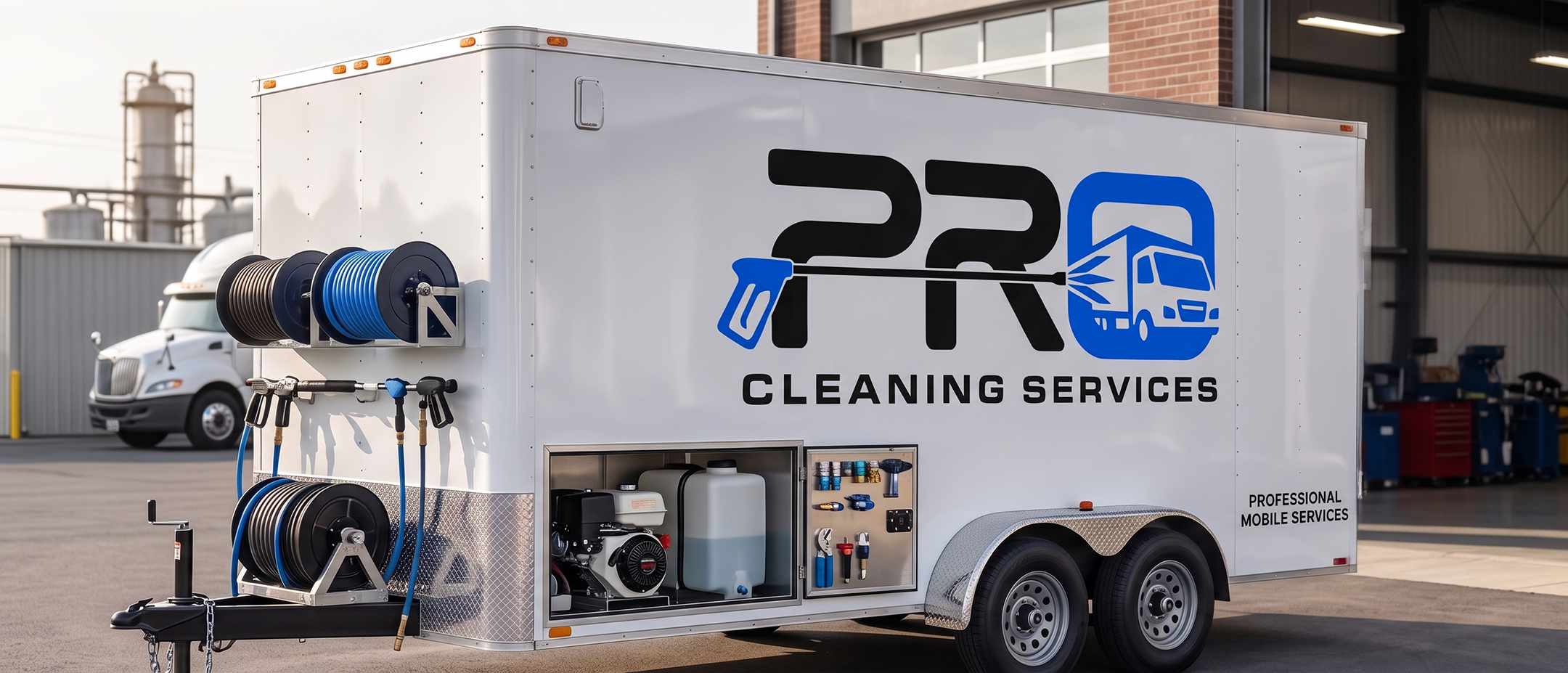
Pro Cleaning Services was repositioning itself toward commercial fleet washing, requiring a brand that felt dependable, modern, and recognizable from a distance. The previous identity lacked the clarity needed for vehicle graphics, uniforms, and fleet-focused marketing.
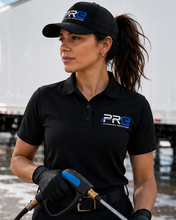
The goal was to create a modern and flexible visual system that felt professional without becoming overly corporate. The new identity needed to work across trucks, employee uniforms, advertisements, websites, and sales materials while remaining recognizable at both large and small sizes.

Previous Identity
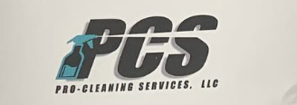
The existing identity used several different logo treatments, type styles, and visual effects. This made the brand difficult to apply consistently across service materials and digital platforms.
I focused on simplifying the logo, strengthening its visual hierarchy, and creating a more unified system that could clearly communicate the company’s fleet-cleaning services.
Concept Development
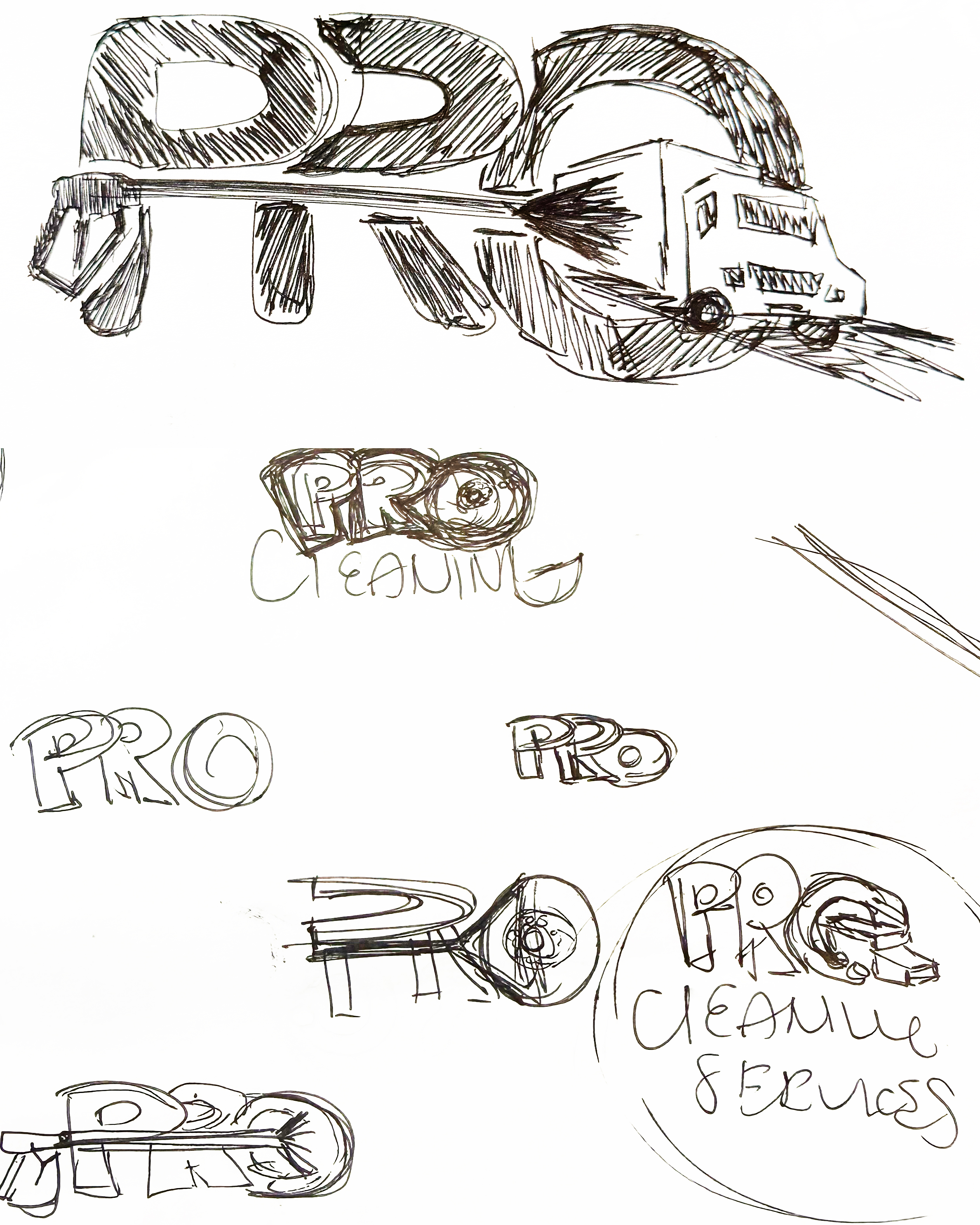
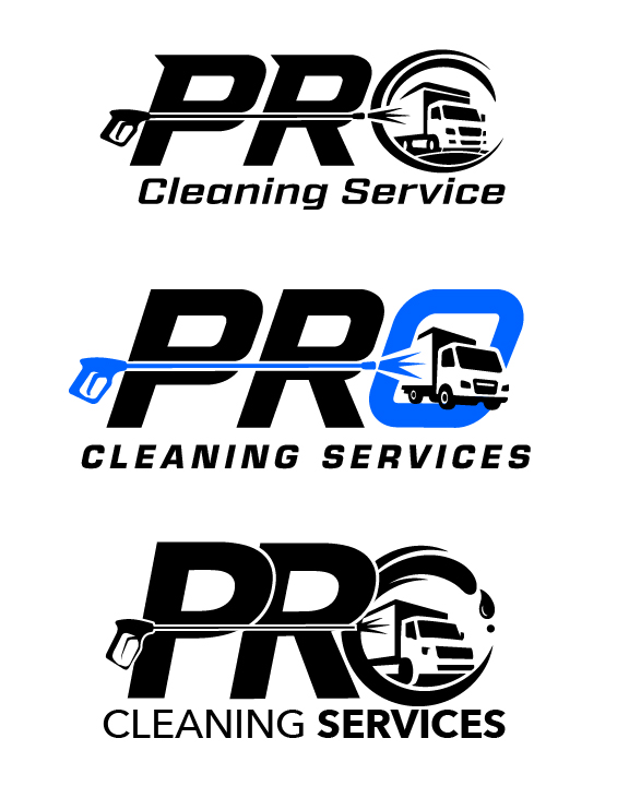
Early concepts experimented with pressure washers, spray patterns, bubbles, and shield-inspired forms before shifting toward a simpler solution. The final direction centered around a truck emerging from the letter O, creating a memorable symbol that immediately communicates fleet services without relying on literal cleaning equipment.
During refinement, I simplified the truck, adjusted the weight and spacing of the letterforms, and softened the corners to create a more approachable industrial identity. The final mark was tested in horizontal, stacked, one-color, and reversed formats to ensure it could function across a wide range of applications.
Final Identity
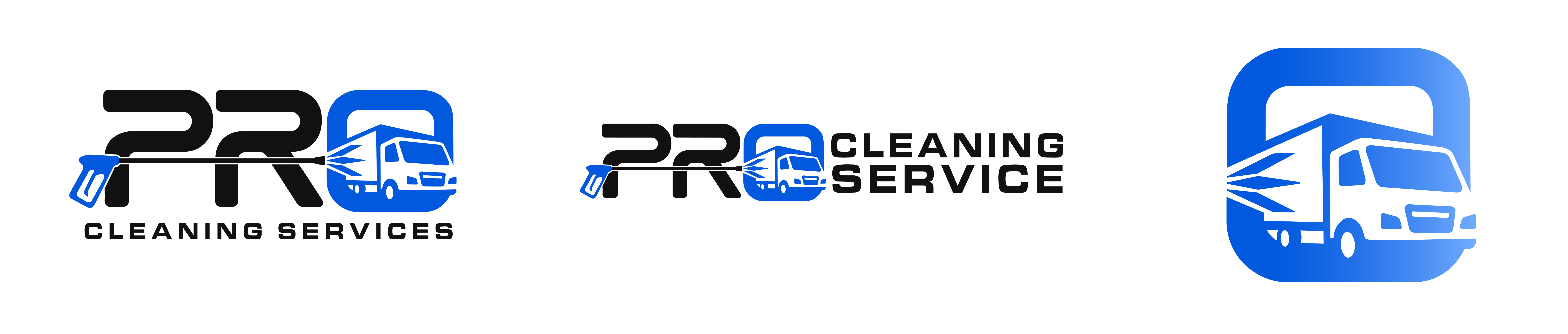
Primary Mark
Secondary Mark
Submark
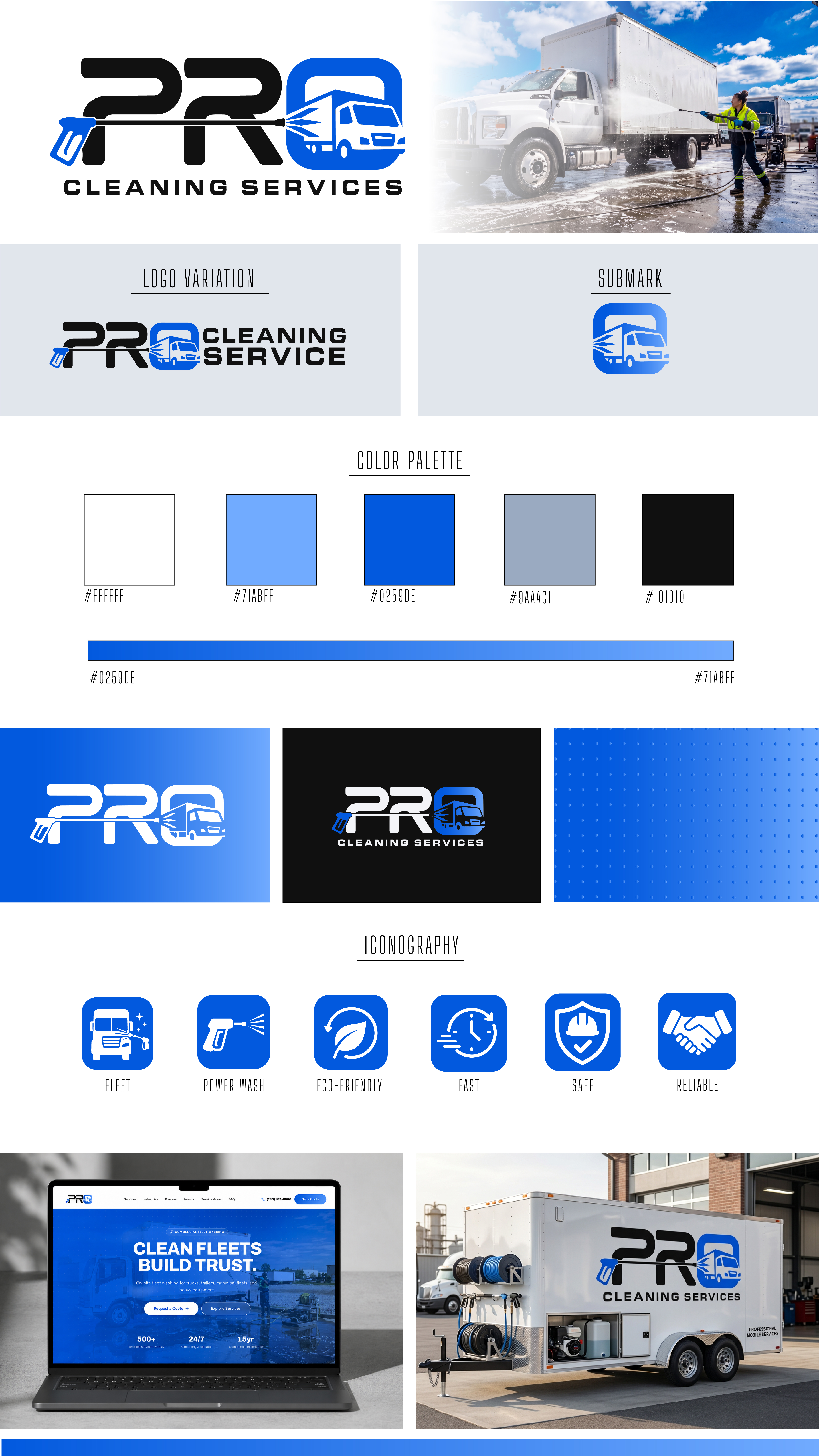
The final identity uses a bold PRO wordmark with a commercial truck integrated into the O. This creates an immediate connection to fleet services while keeping the logo compact, clear, and easy to recognize.
Rounded forms and a blue color system help the brand feel dependable, modern, and approachable. The complete logo system includes horizontal, stacked, reversed, and simplified versions for use across vehicles, uniforms, advertising, websites, and smaller branded materials.
Brand Applications
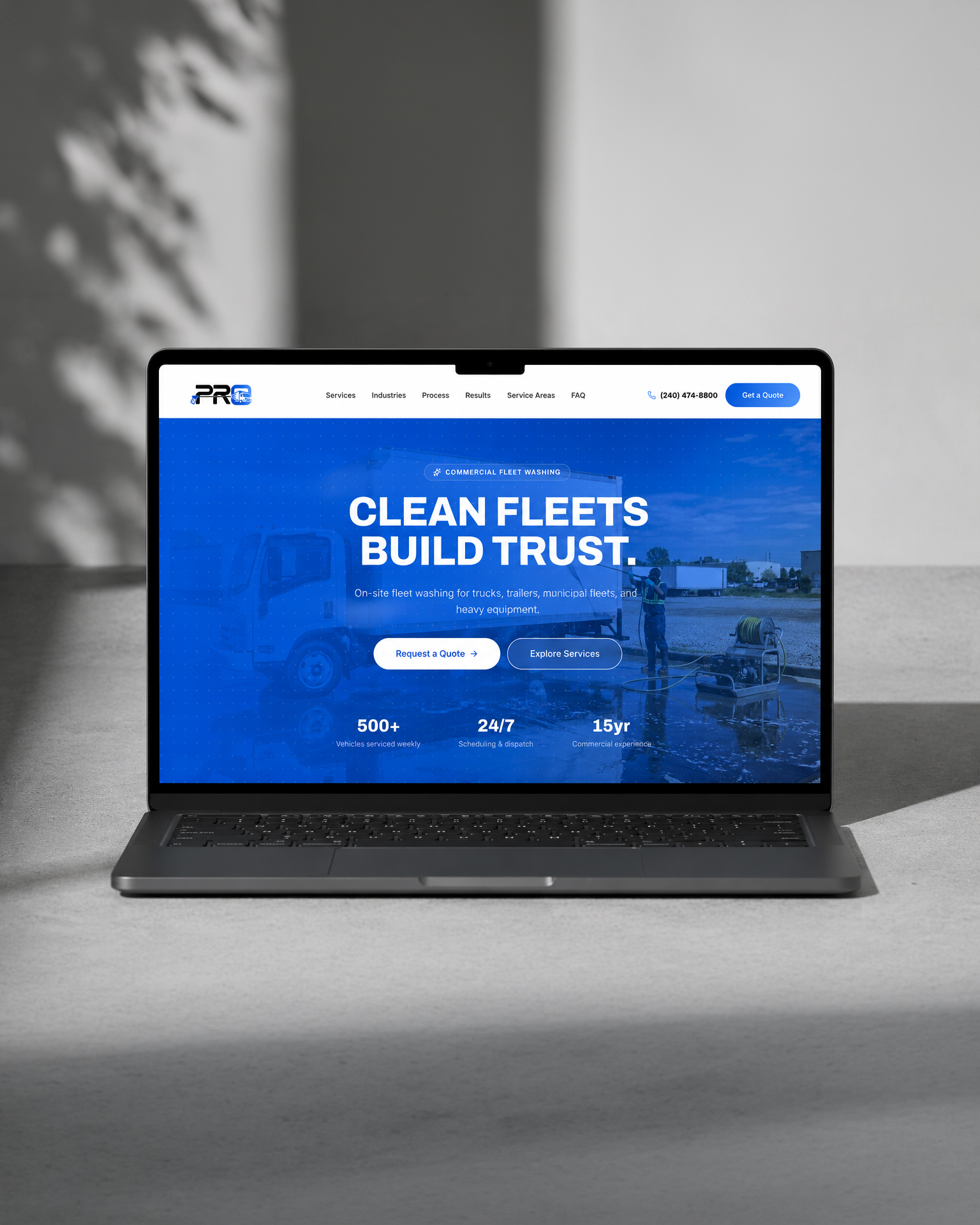


Quick Brand Guide
A condensed reference guide was created to help the client apply the identity consistently across everyday materials. It brings the primary logos, color palette, typography, icons, and example applications together in one accessible format.