

Druitt Logistics
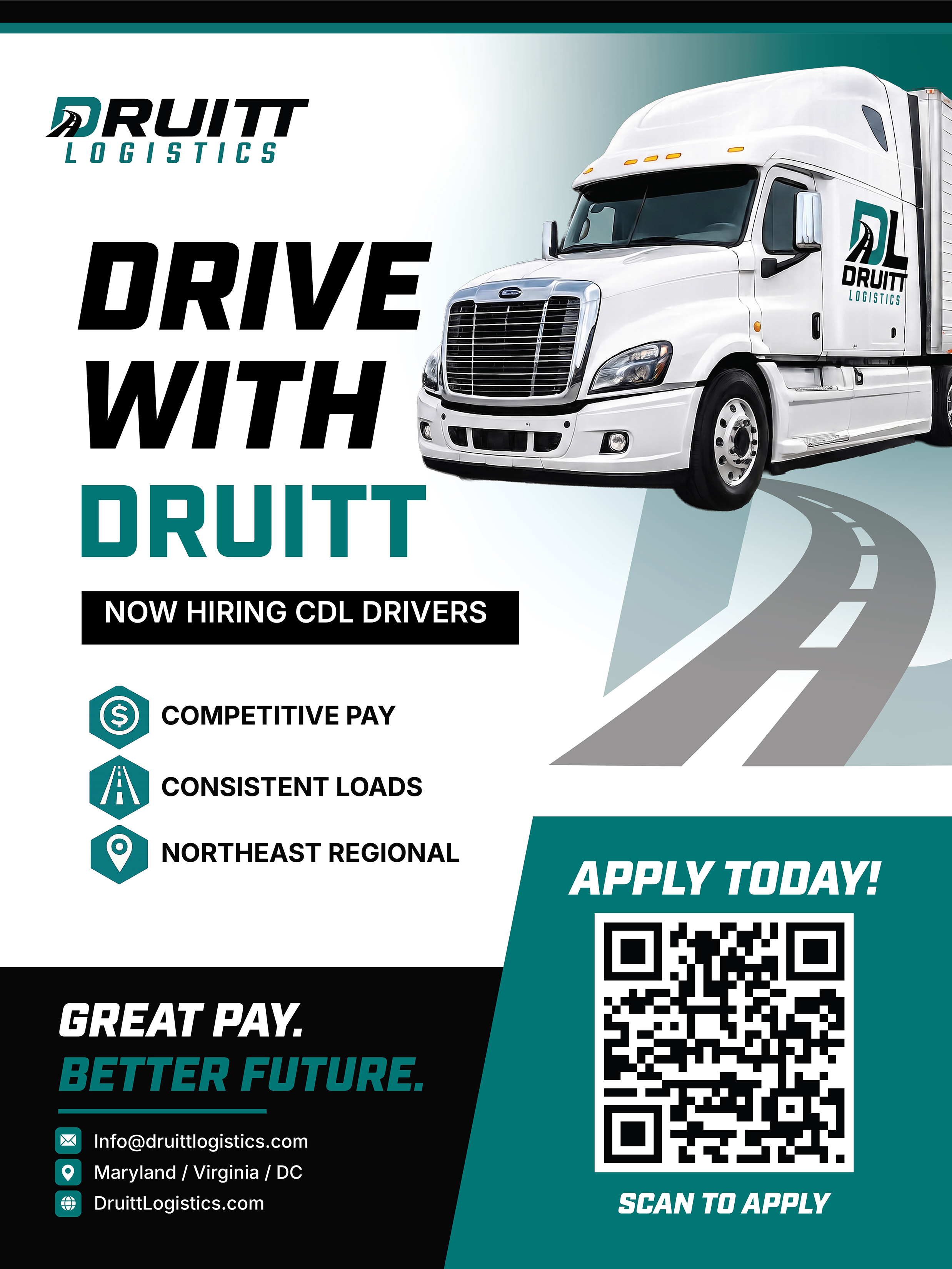
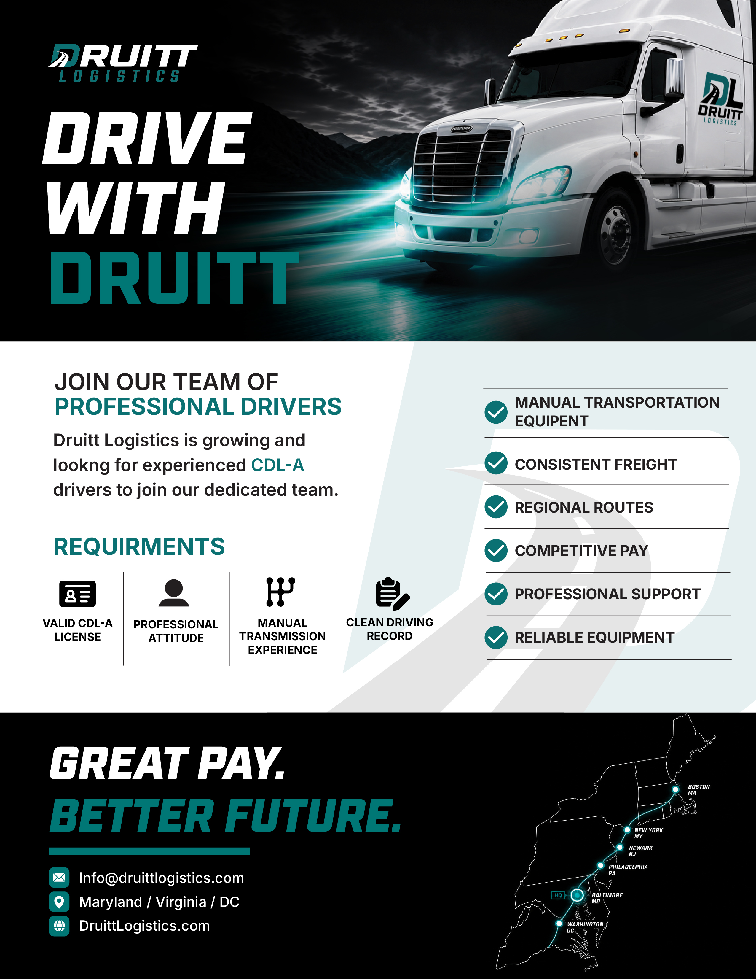
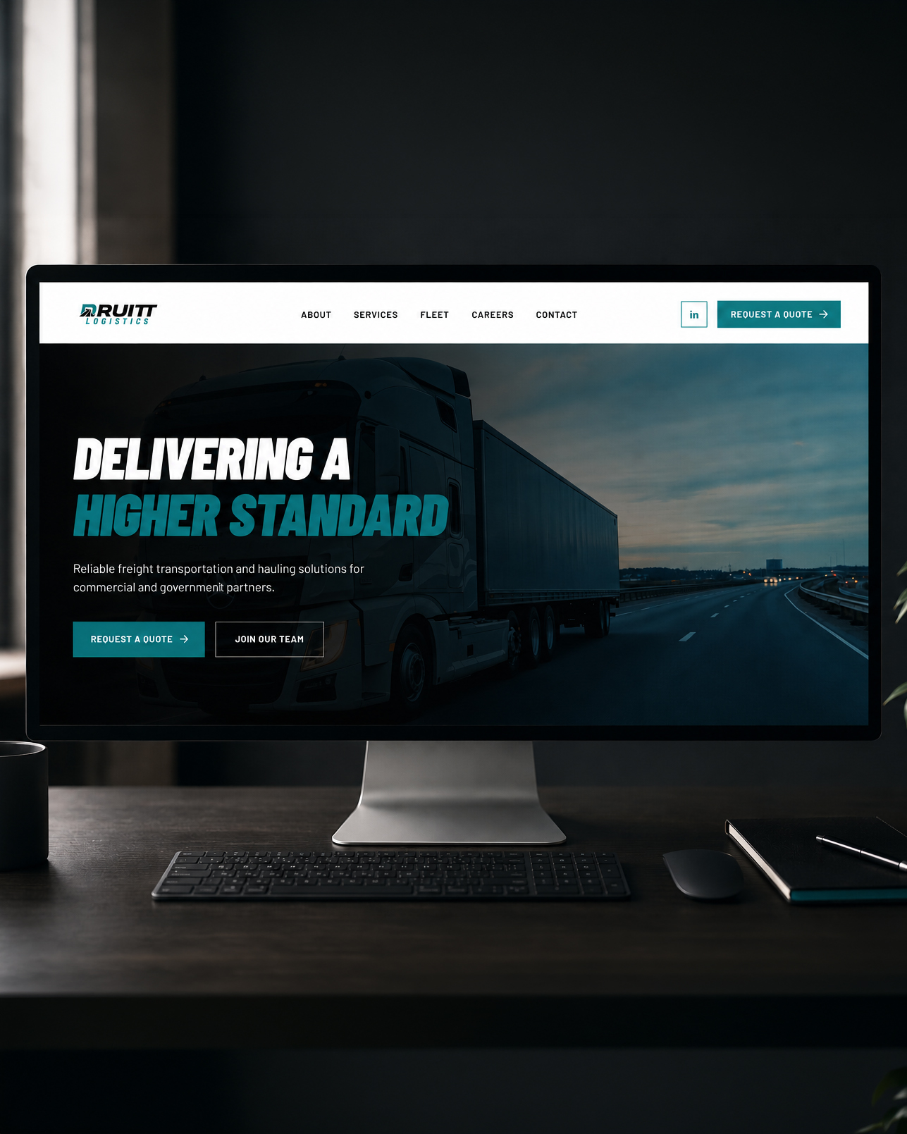
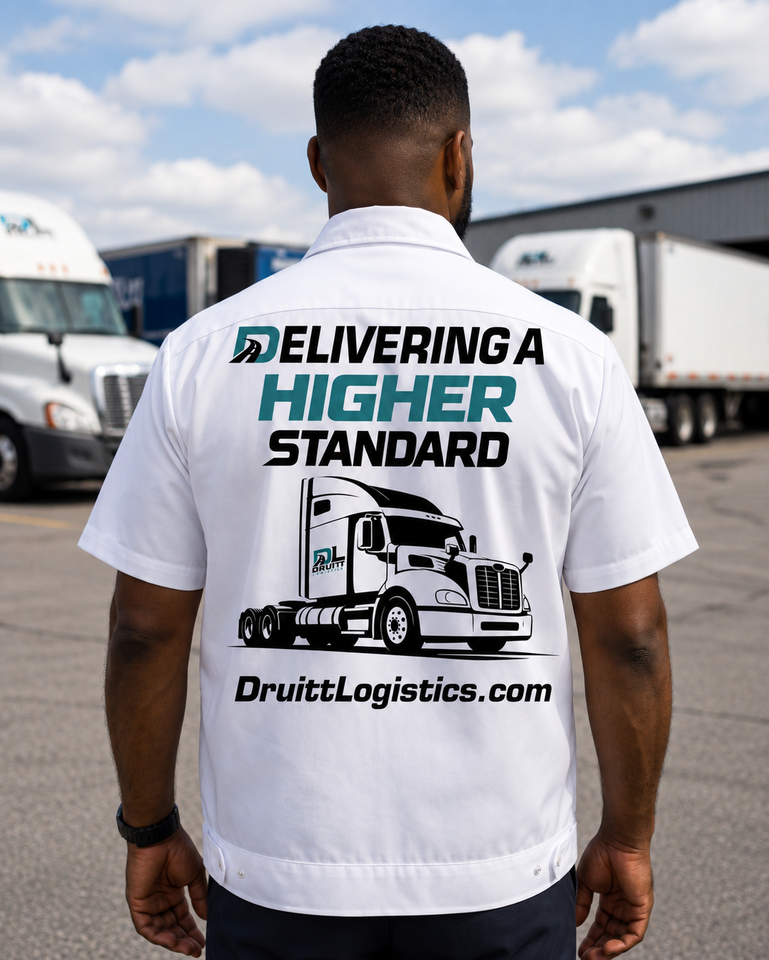
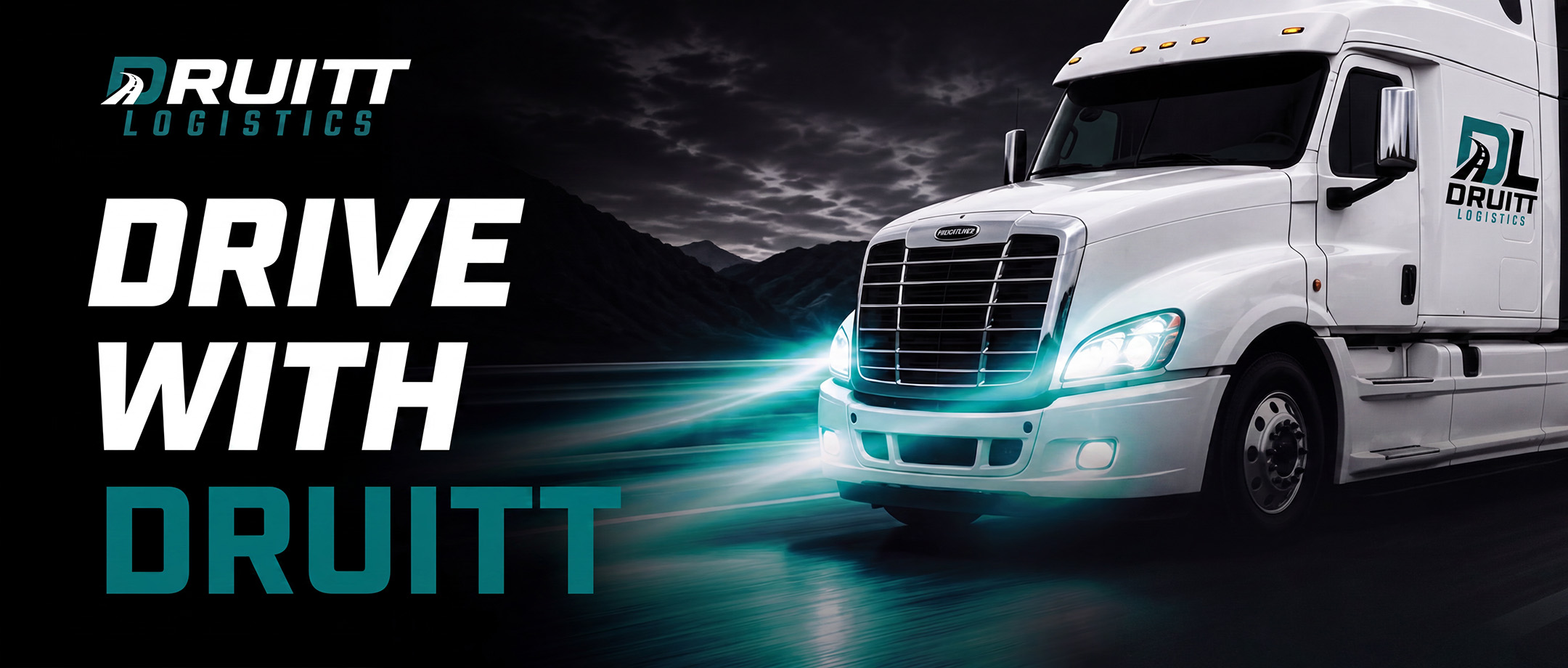
A transportation and logistics rebrand developed to create a stronger, more recognizable identity across fleet graphics, recruitment, apparel, marketing materials, and digital applications.
TYPE: Branding, Web Design
TOOLS: Illustrator, Photoshop, InDesign
SCOPE: Logo System, Recruitment Materials, Vehicle Graphics, Apparel, Marketing Materials, Website Design
Problem / Goal
Druitt Logistics had built a dependable transportation business, but its visual identity didn't reflect the professionalism or scale of its services. The existing branding lacked consistency across vehicles, digital platforms, and recruiting materials, making it difficult to present the company as an established logistics provider.
The goal was to create a flexible logo system that communicated movement, reliability, and forward progress while remaining clear at both small and large sizes. The new identity also needed to strengthen the company’s credibility with drivers, customers, and business partners.
Previous Identity
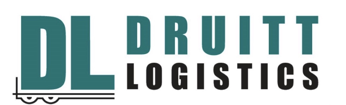
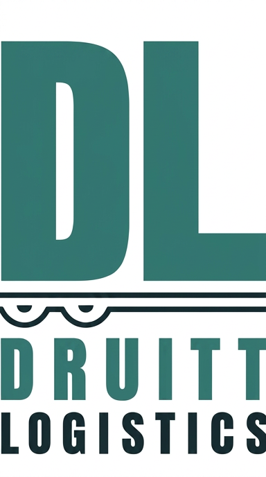
The original identity used multiple logo arrangements, but the proportions, typography, and visual hierarchy were not consistent across the system.
I focused on simplifying the structure, improving readability, and developing a flexible identity that could maintain its impact across trucks, apparel, print materials, recruitment graphics, and digital use.
Concept Development
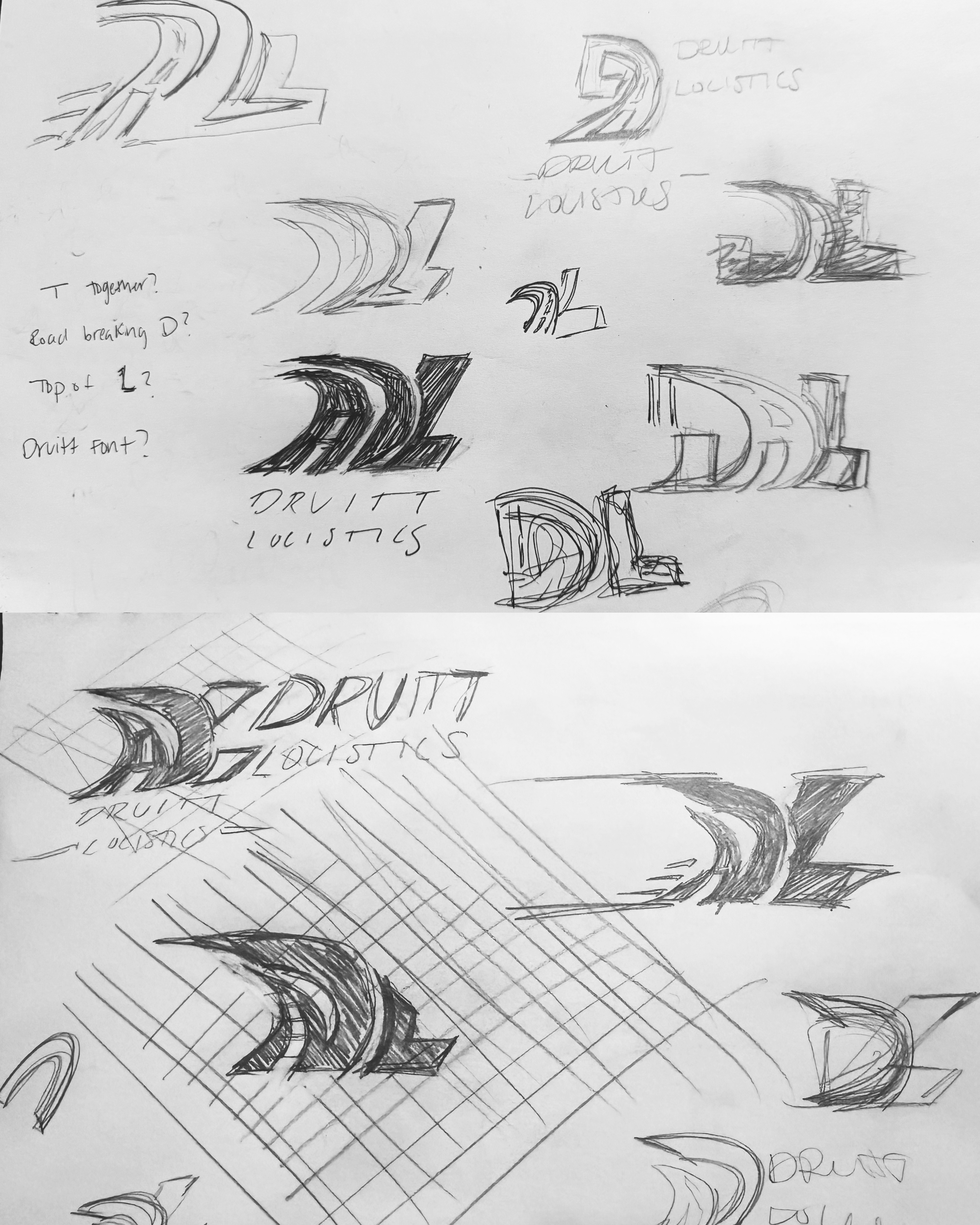
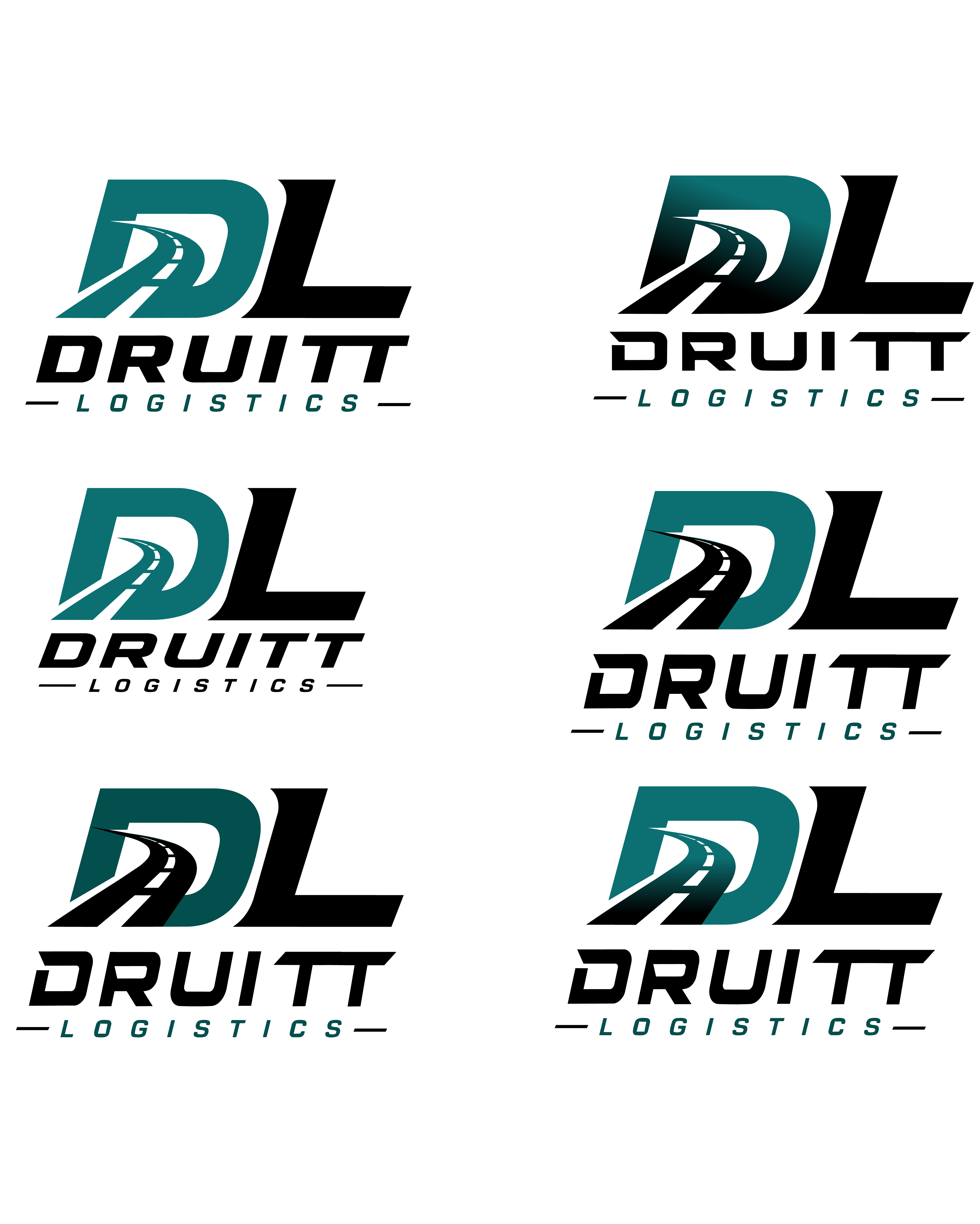
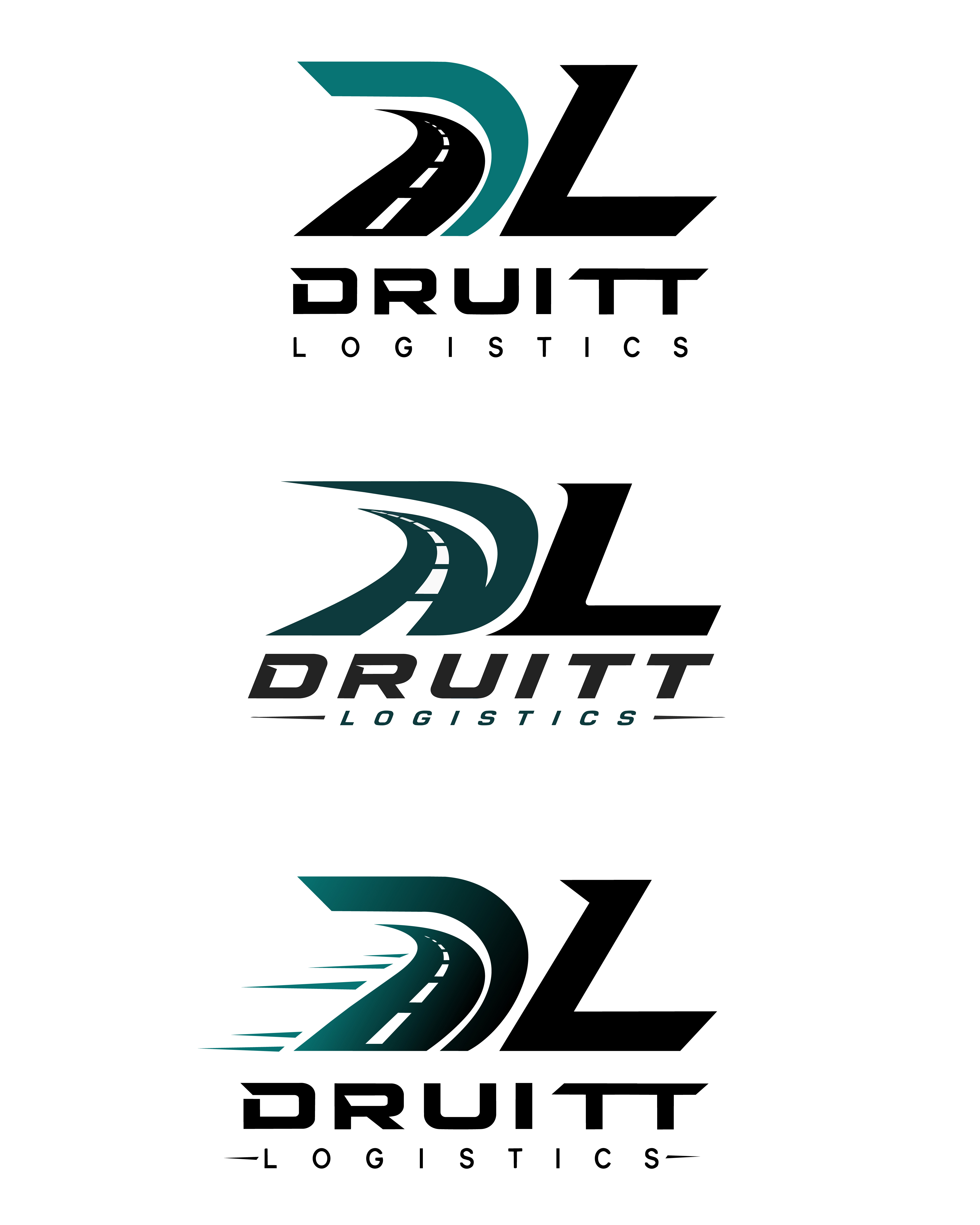
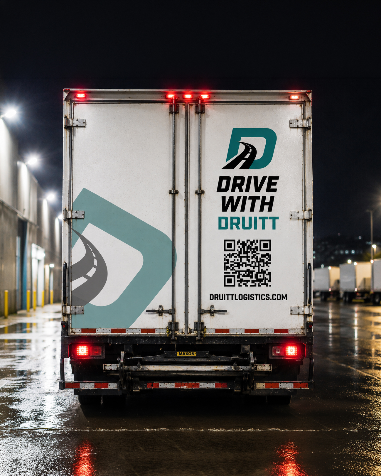
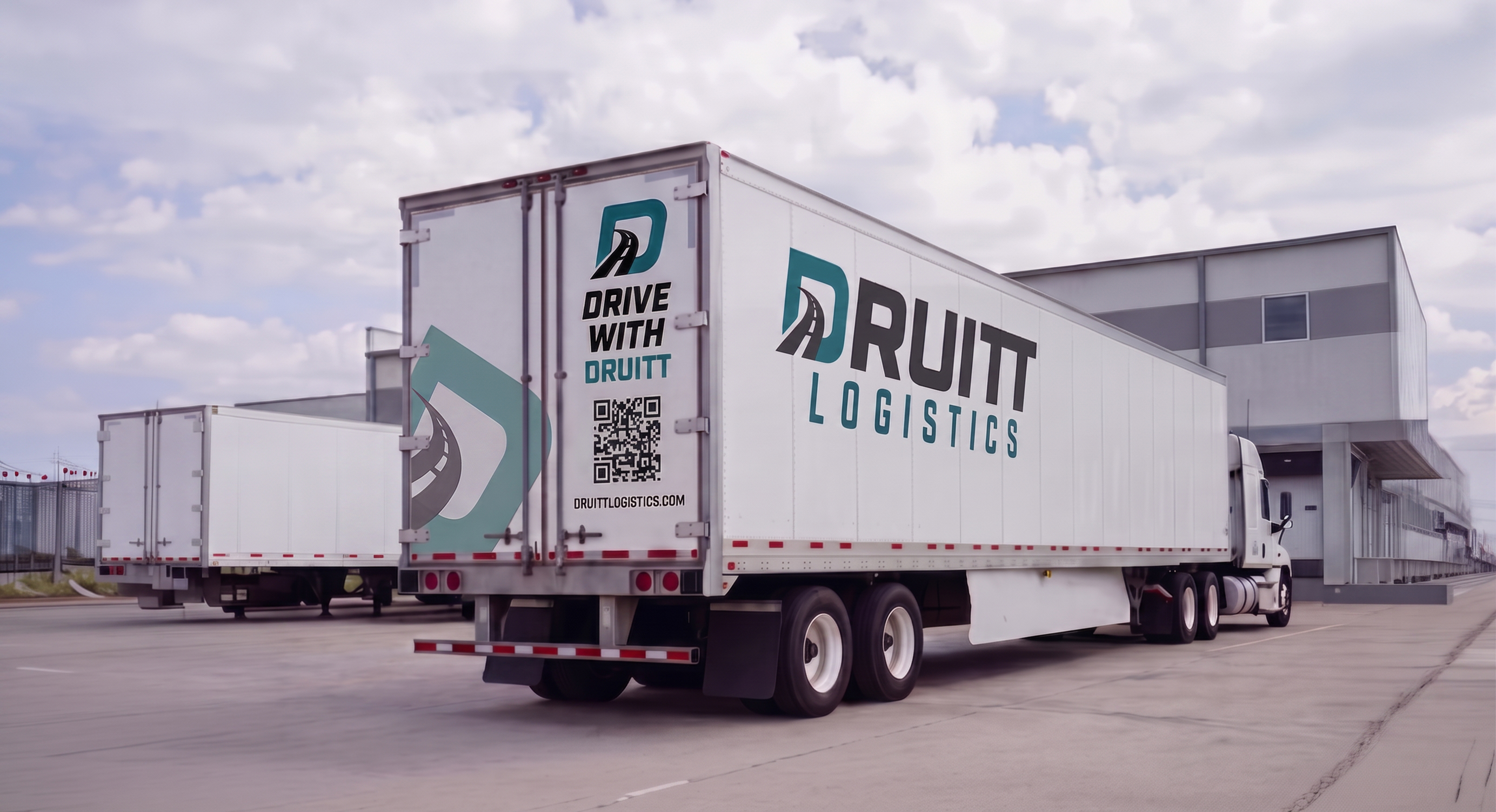
Early concepts explored integrating roadways, directional movement, and the letters D and L into a single recognizable mark. The challenge was creating a logo that remained simple enough to reproduce on trucks while still communicating transportation and forward movement.
The selected concept was refined by simplifying the roadway, adjusting the relationship between the D and L, and improving the proportions of the supporting typography. Each version was tested at different sizes to make sure the identity remained recognizable on everything from commercial trucks to small digital applications.
Final Identity

Primary Mark
Secondary Mark
Submark
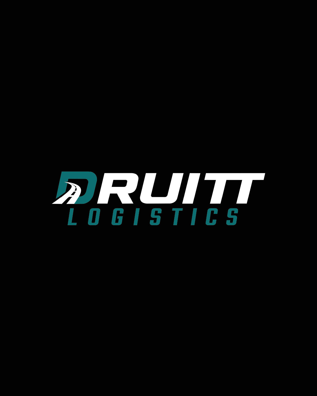
The final identity combines a bold DL monogram with a simplified road running through the D. The angled letterforms and roadway communicate direction and movement, while the heavier construction gives the logo enough presence for transportation and large-format applications.
The system includes a stacked primary mark, horizontal secondary mark, and compact submark. Each version maintains the same visual language, allowing the company to remain consistent across light and dark backgrounds, print materials, vehicles, apparel, and digital platforms.
Brand Applications