

We Got Granite
& Marble
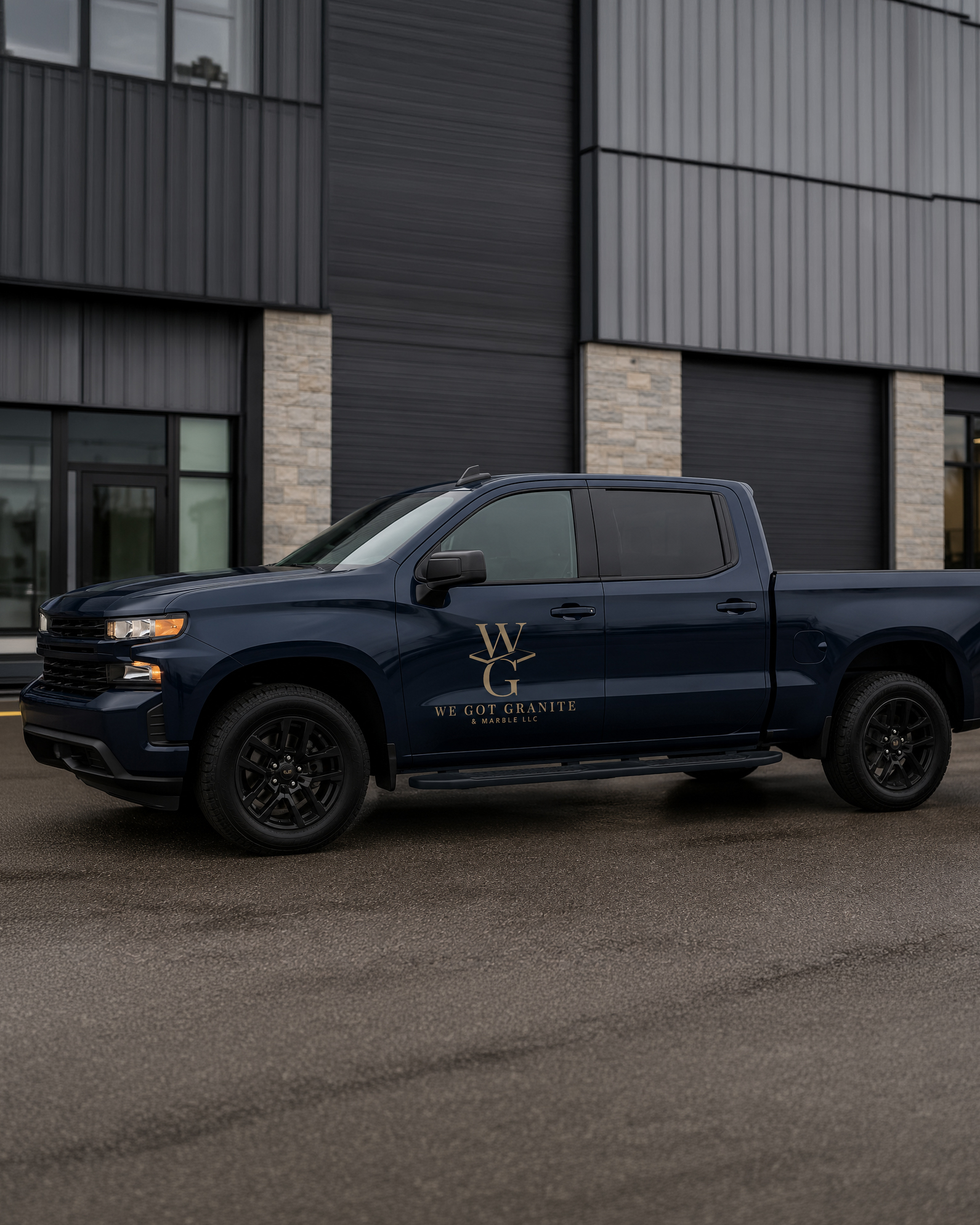
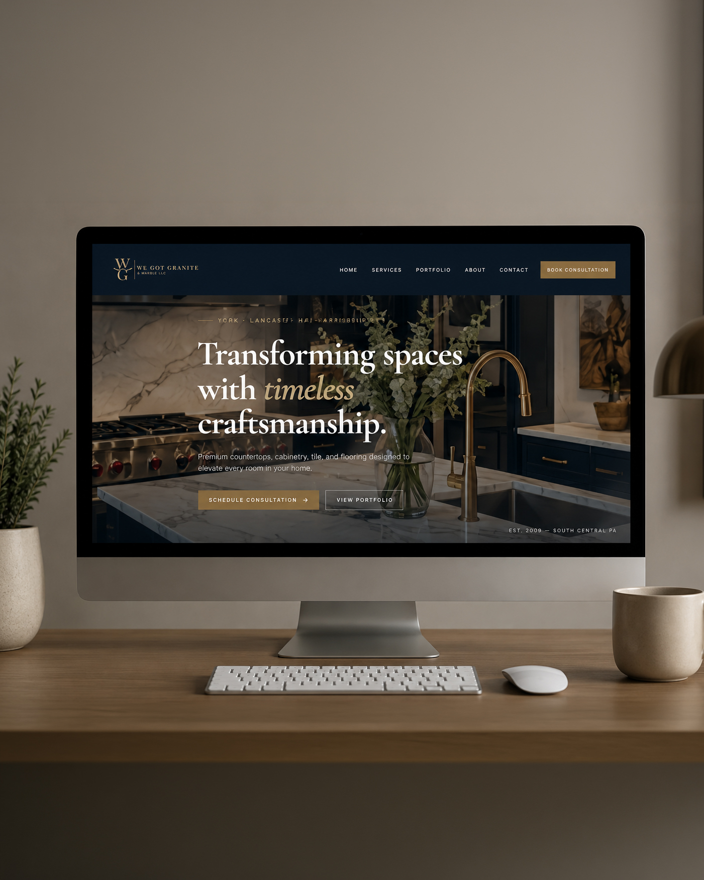
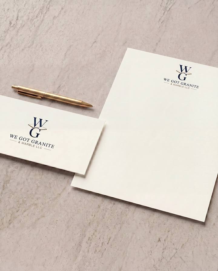
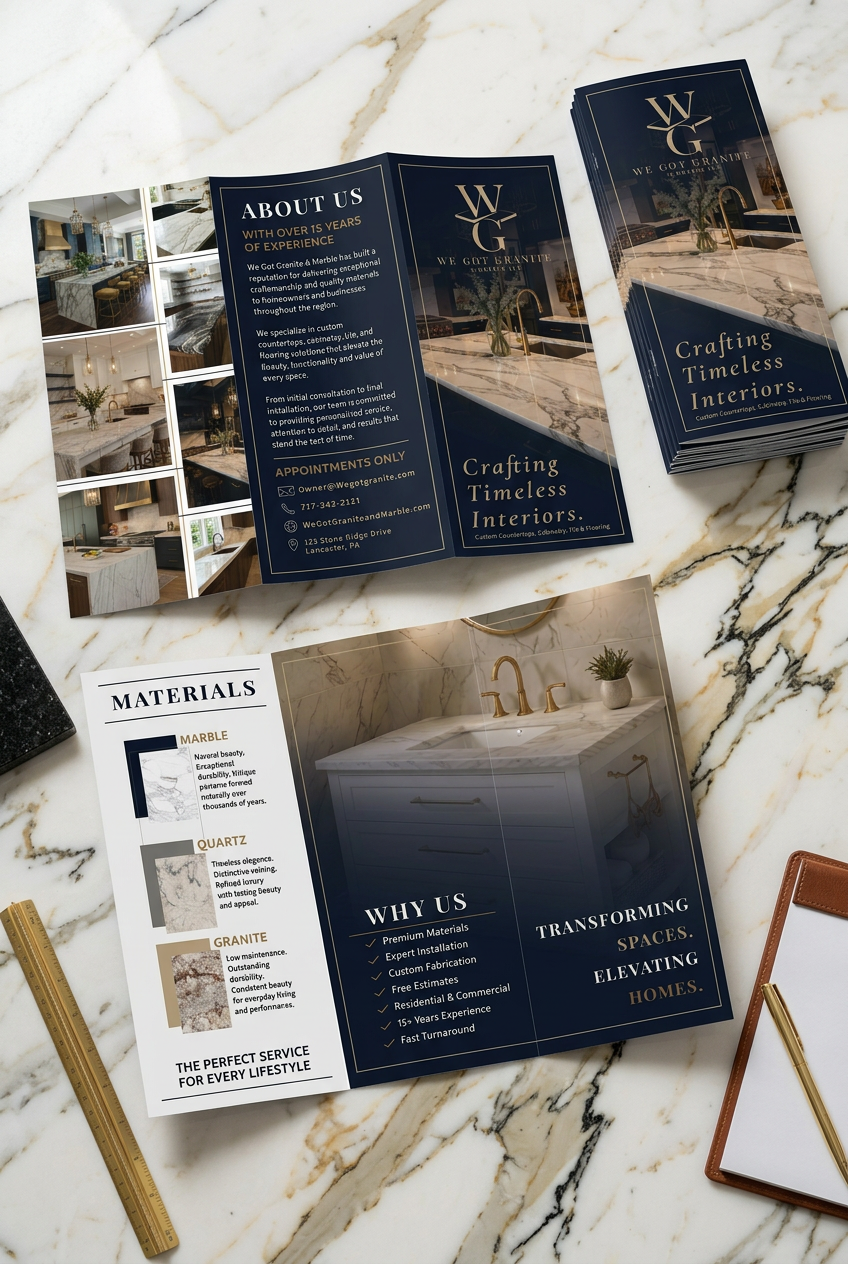
A luxury rebrand developed to create a more refined and professional identity for a stone and countertop company across signage, print, vehicle graphics, and digital platforms.
TYPE: Branding, Web Design
TOOLS: Illustrator, Photoshop, InDesign
SCOPE: Logo System, Brand Identity, Business Cards, Signage, Vehicle Graphics, Website Design, Brand Guide
Problem / Goal
We Got Granite & Marble had decades of craftsmanship behind its work, but its branding didn't communicate the premium quality of the finished product. The redesign focused on repositioning the company as a luxury stone brand capable of appealing to homeowners, builders, and high-end residential projects.
The goal was to create a refined identity that could appeal to homeowners, contractors, and commercial clients while communicating trust, professionalism, and attention to detail. The new system needed to feel luxurious without becoming overly ornate or disconnected from the practical nature of the business.
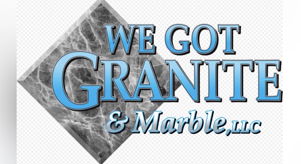
Previous Identity
The original identity used stone textures, decorative lettering, and several visual effects. Although it communicated the company’s industry, it lacked the clarity and restraint needed for a more premium position.
I focused on simplifying the visual language, strengthening the hierarchy, and creating a flexible identity that could remain clear across signage, vehicle graphics, printed materials, websites, and smaller branded applications.
Concept Development
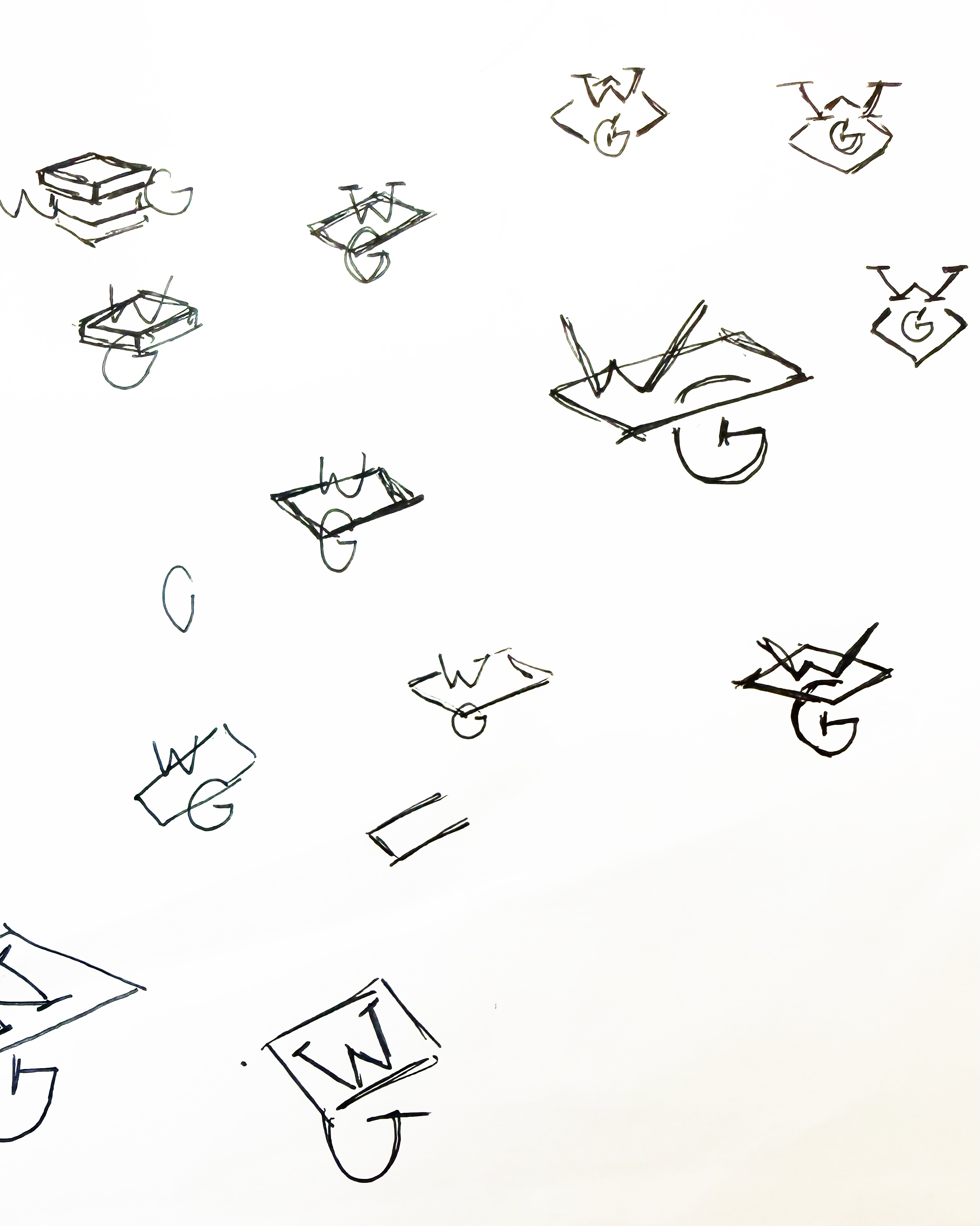
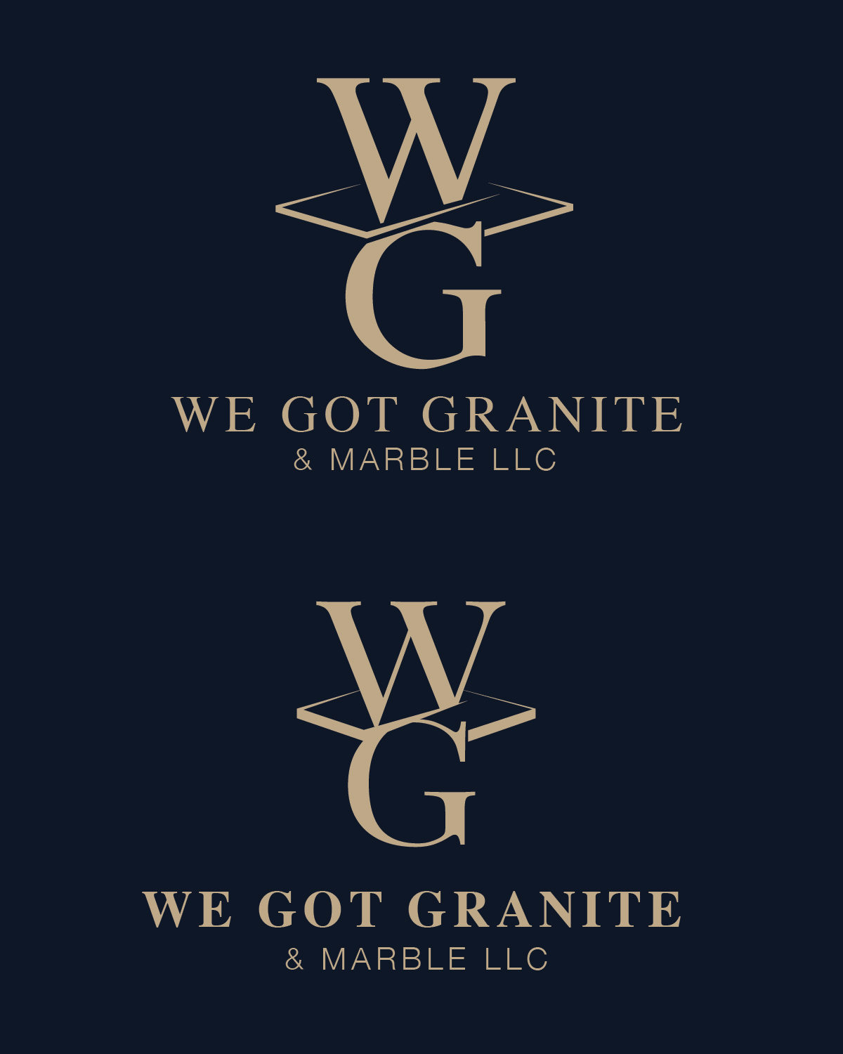
Early concepts investigated how the letters W and G could be combined into a single architectural form inspired by stacked stone and countertop profiles. The final monogram balanced simplicity with structure, creating a distinctive symbol that feels premium while remaining practical across signage, print, and digital applications.
The strongest direction used a structured WG monogram with subtle perspective inspired by layered stone surfaces. The geometry was refined to create a mark that felt distinctive and luxurious while remaining practical for signage, print production, vehicle graphics, and digital use.
Final Identity

Primary Mark
Secondary Mark
Submark
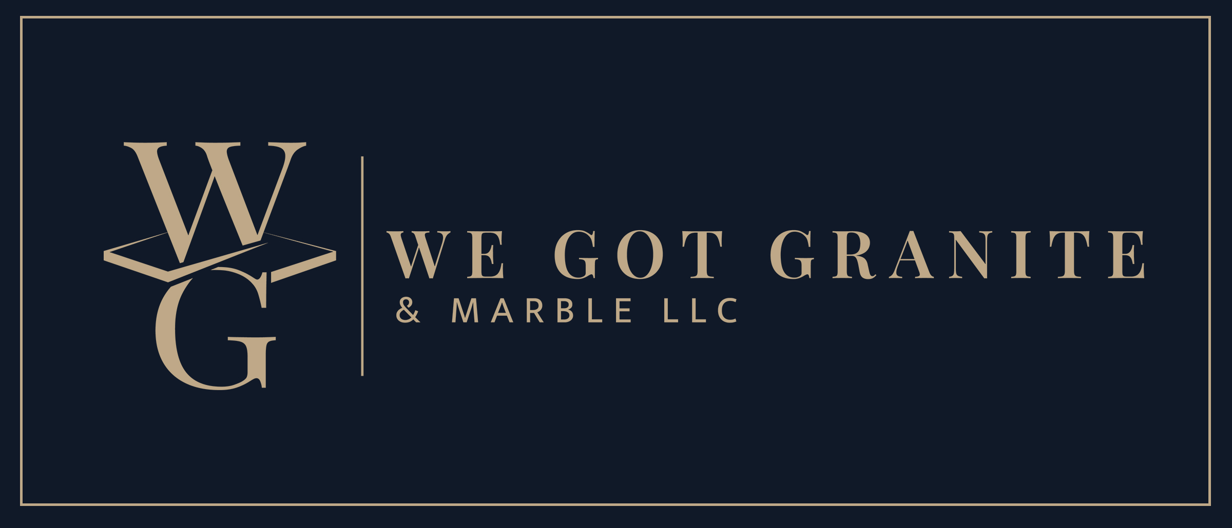
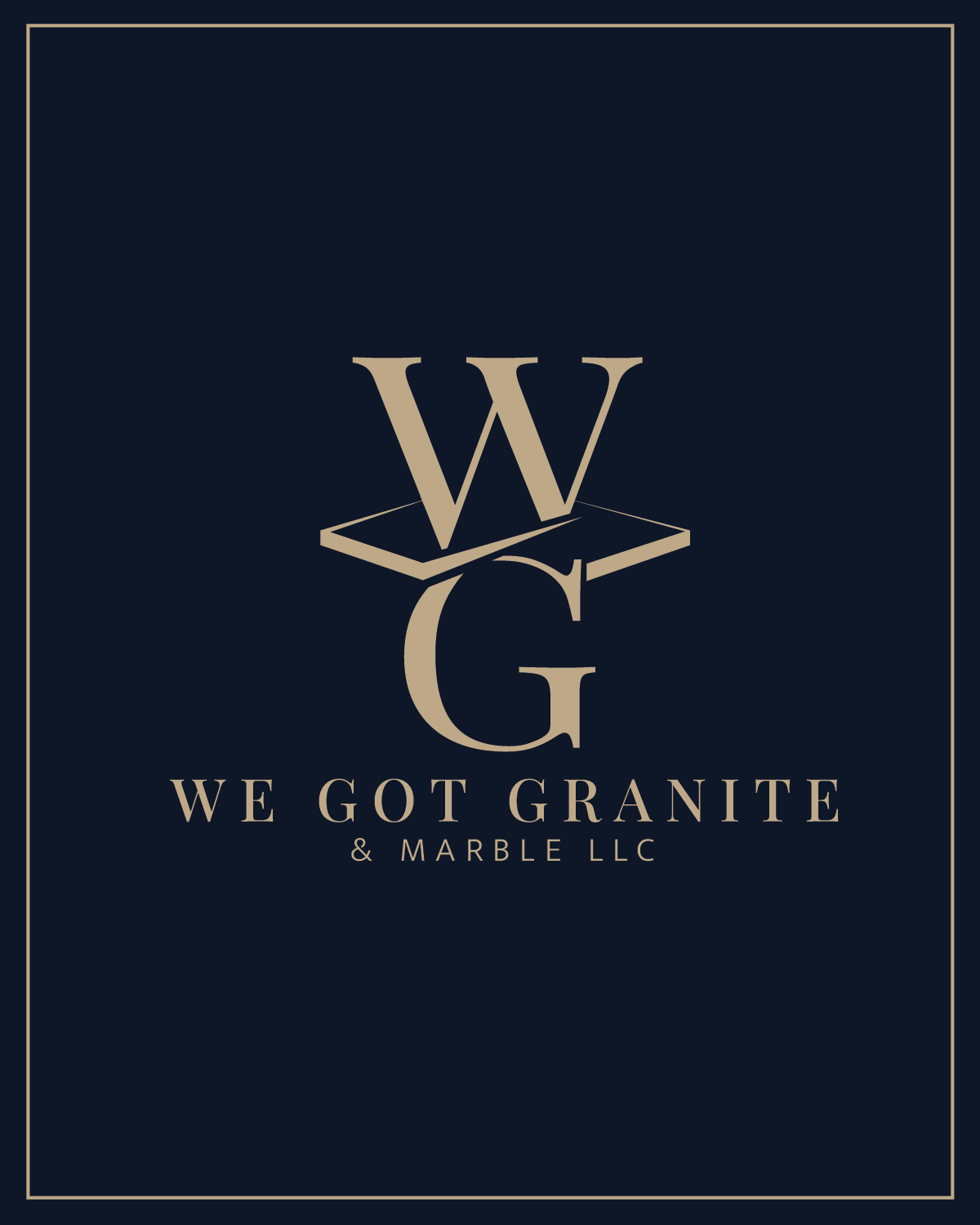
The final identity combines a geometric WG monogram with refined typography and a restrained navy, ivory, and metallic-gold palette. The monogram references the layered structure of stone while giving the company a recognizable symbol that can stand independently.
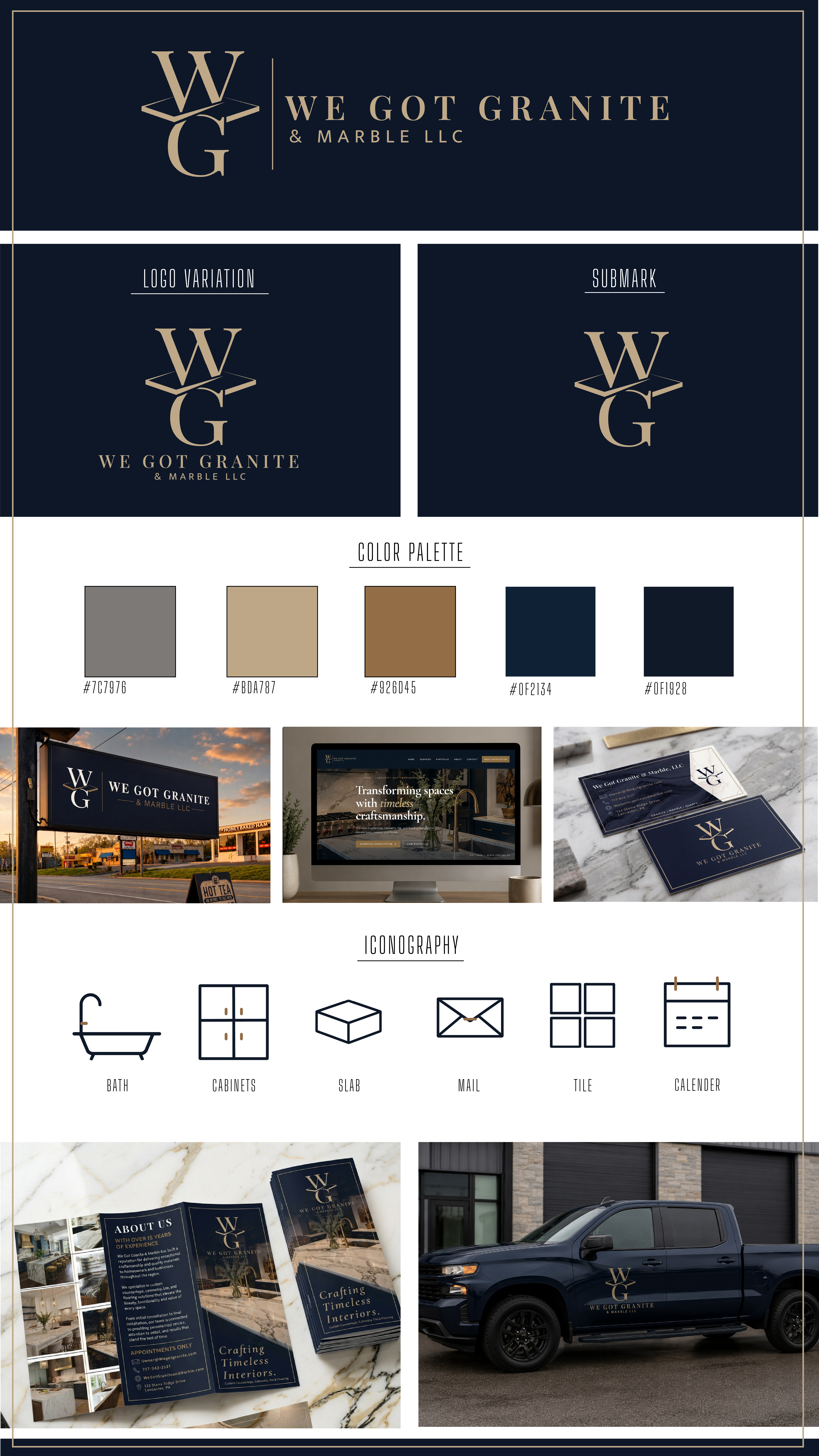
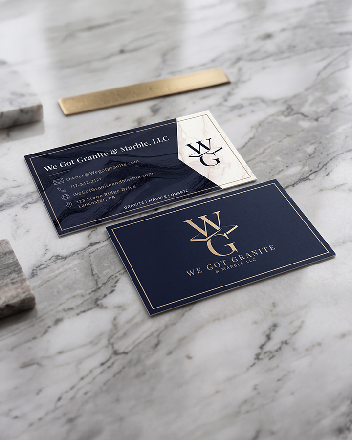
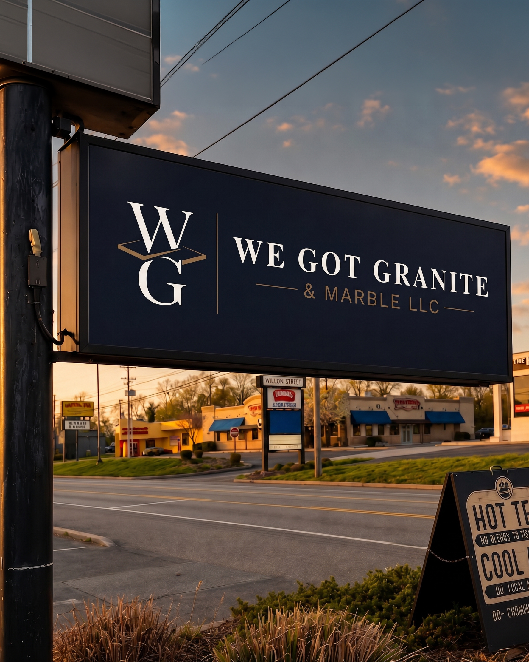
A primary logo, horizontal secondary mark, and compact submark provide flexibility across large and small applications. The completed system creates a consistent visual presence across signage, business materials, vehicle graphics, websites, and branded presentations.
Brand Applications
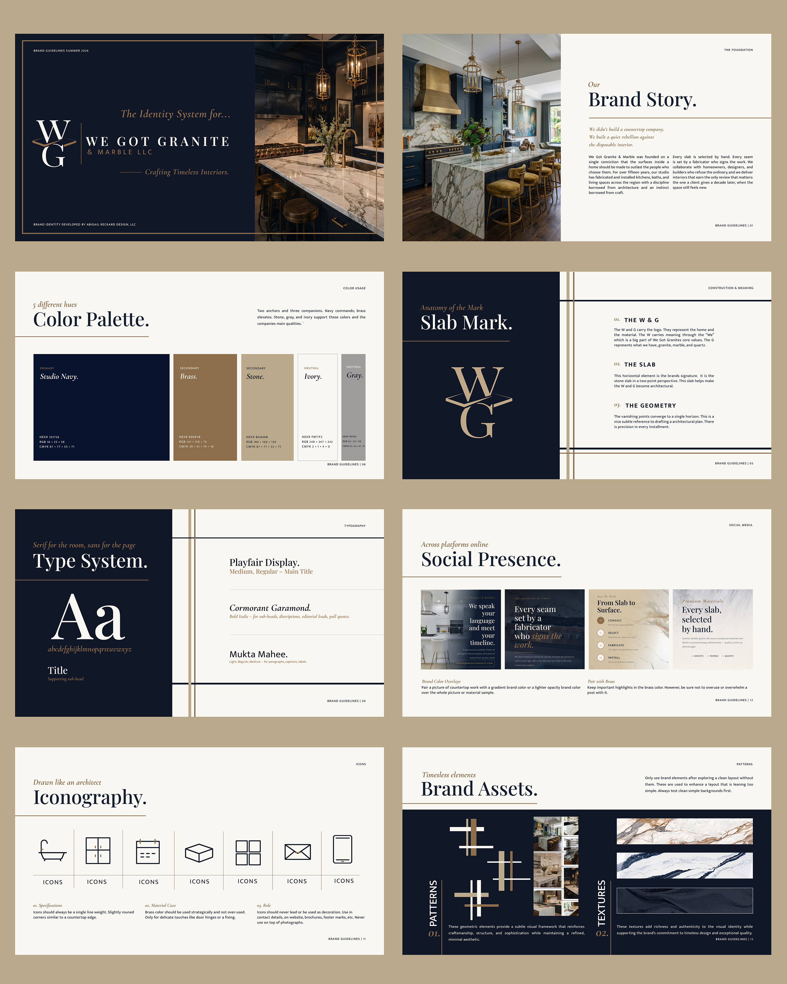
Quick Brand Guide
A condensed one-page guide was created to help maintain consistency across future materials. It brings the logo system, color palette, typography, graphic elements, and key applications together in one accessible reference.